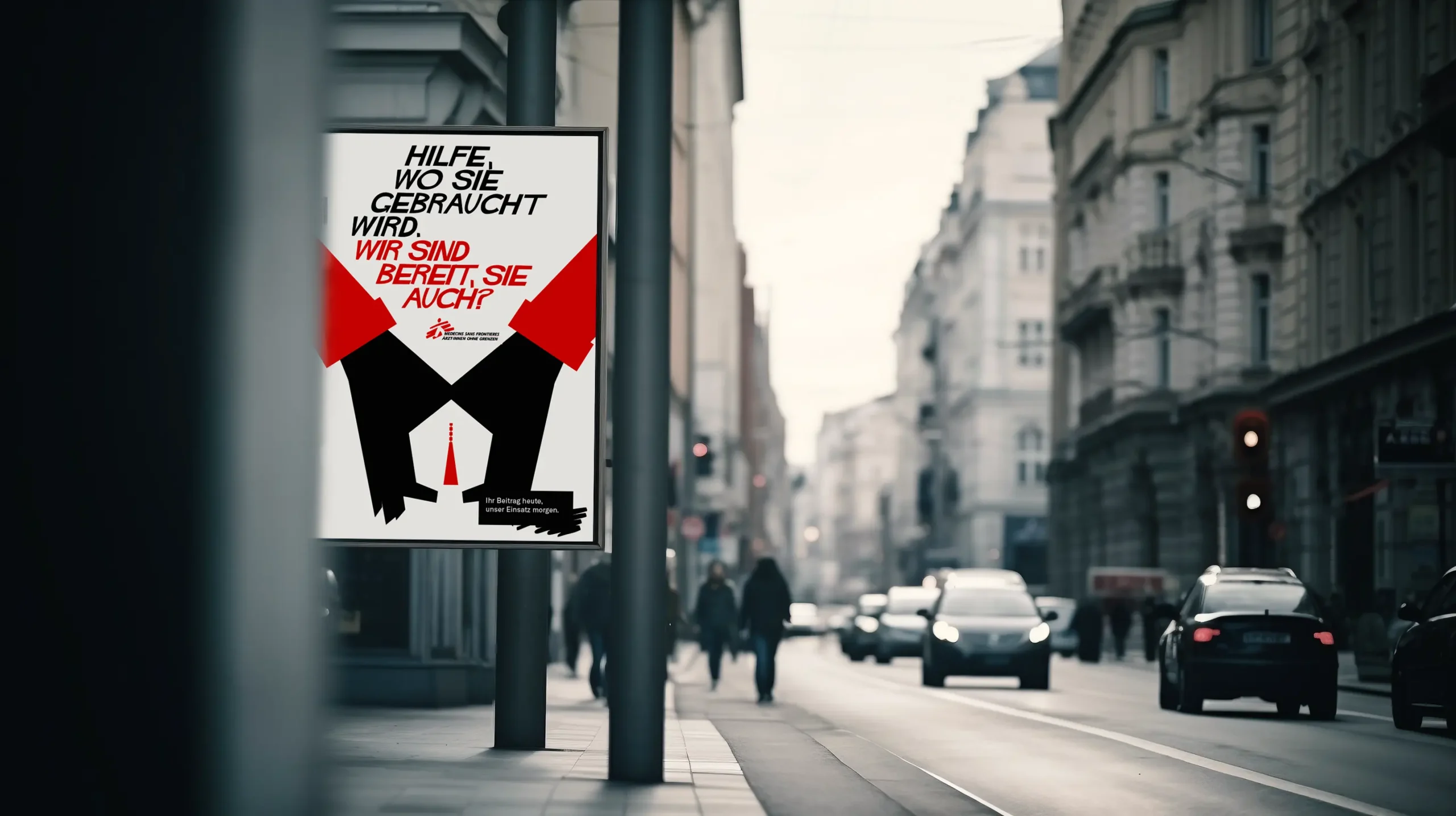
Concept work (not realised)
Hilfe, wo sie gebraucht wird
summary
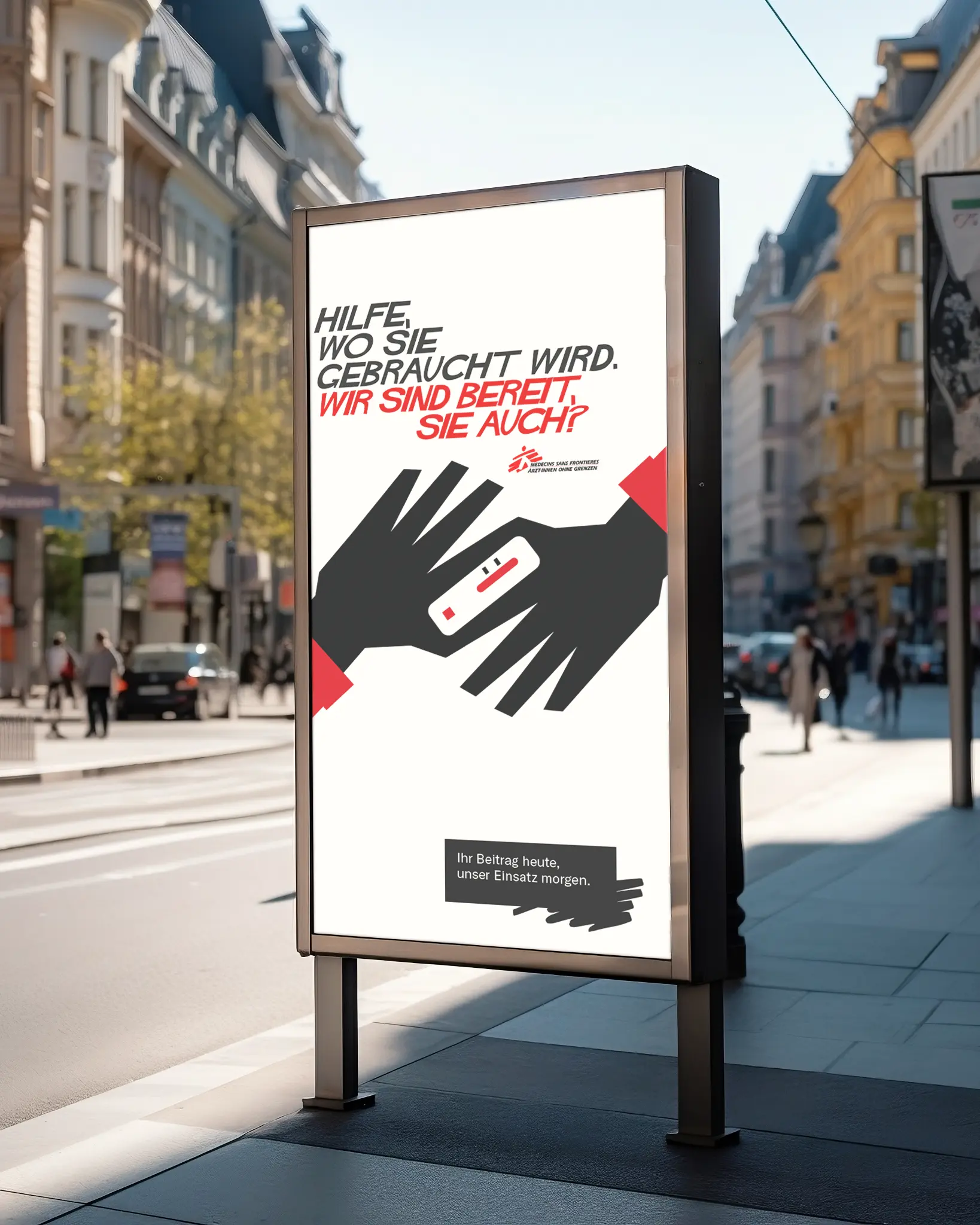
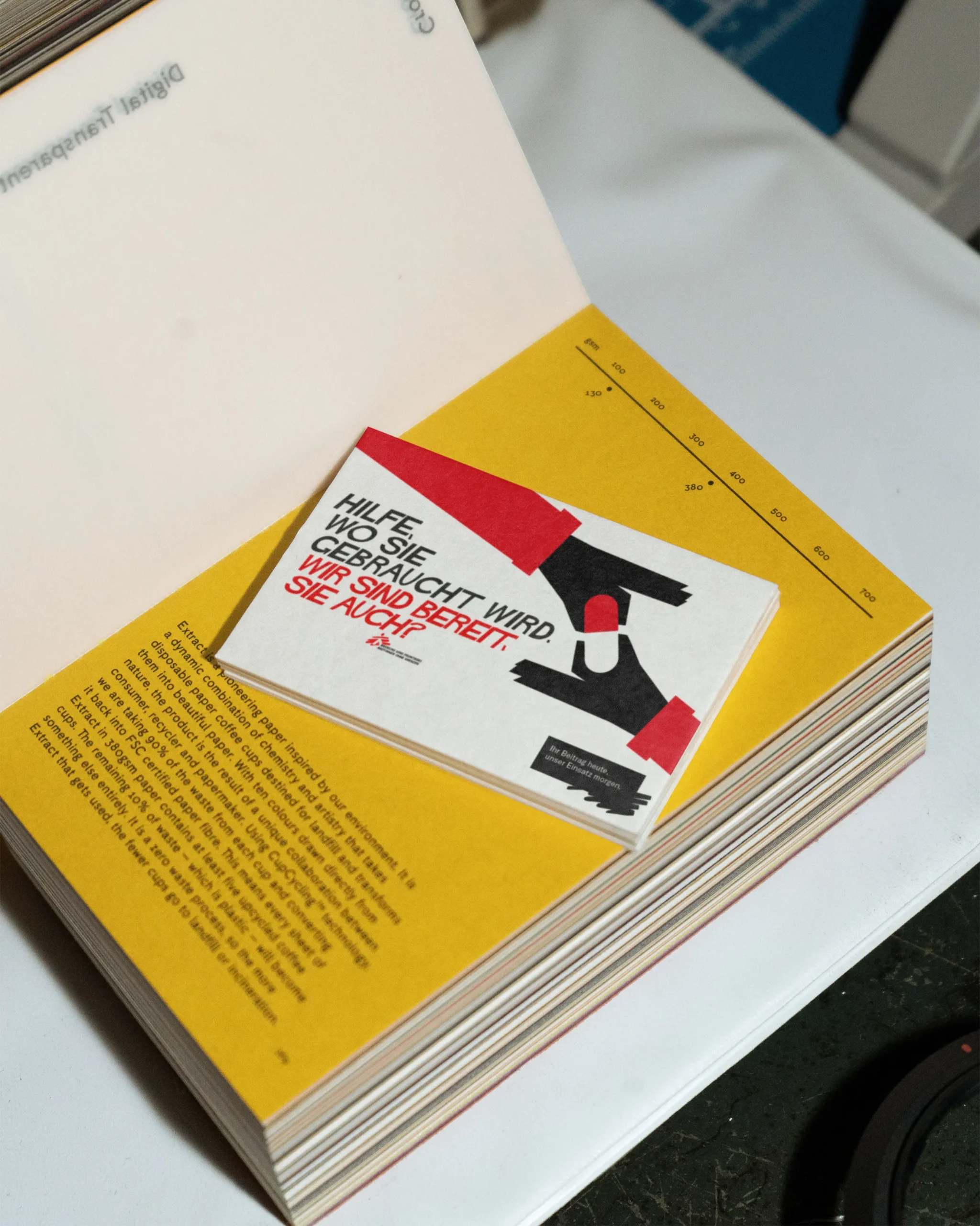
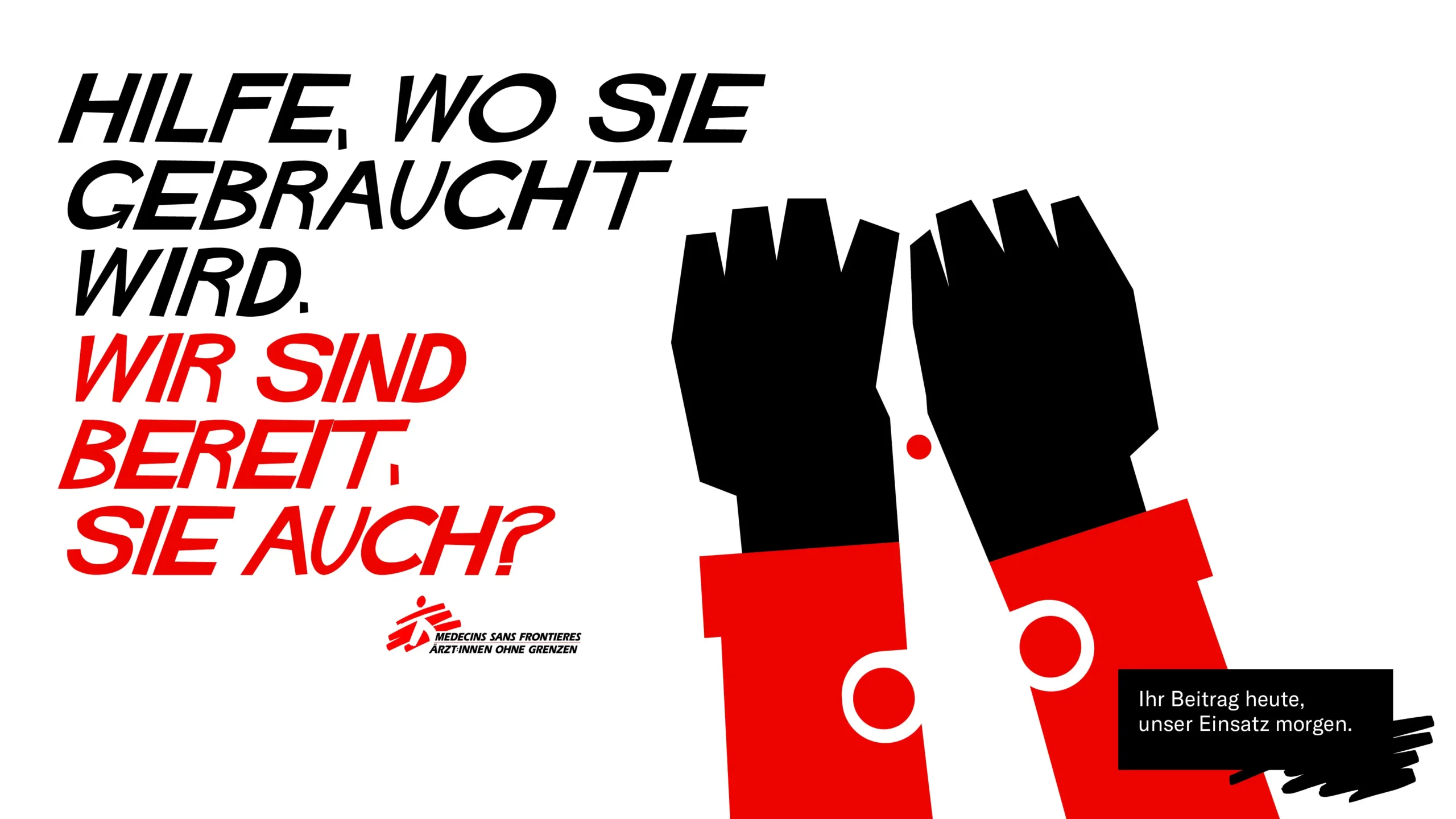
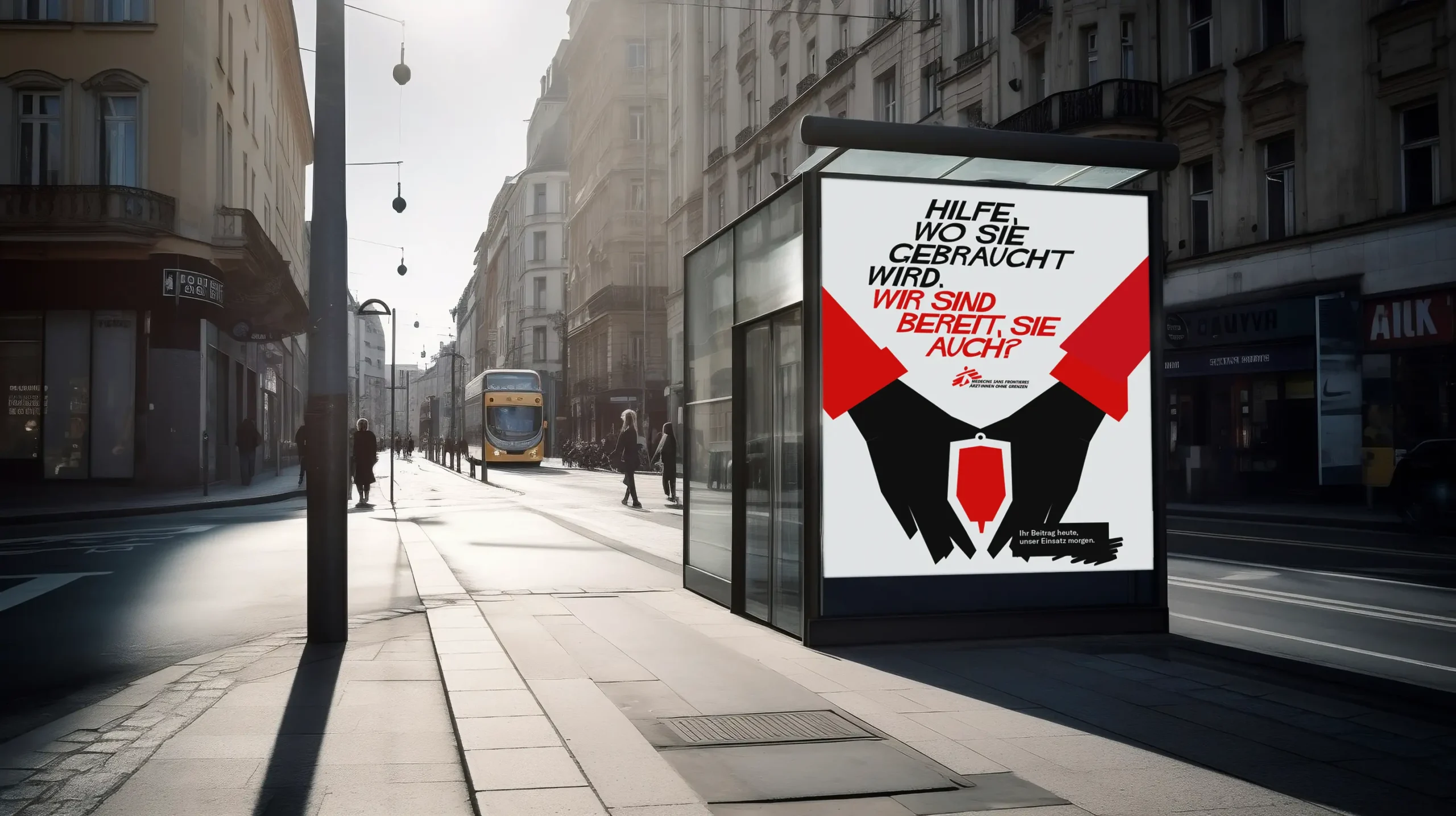
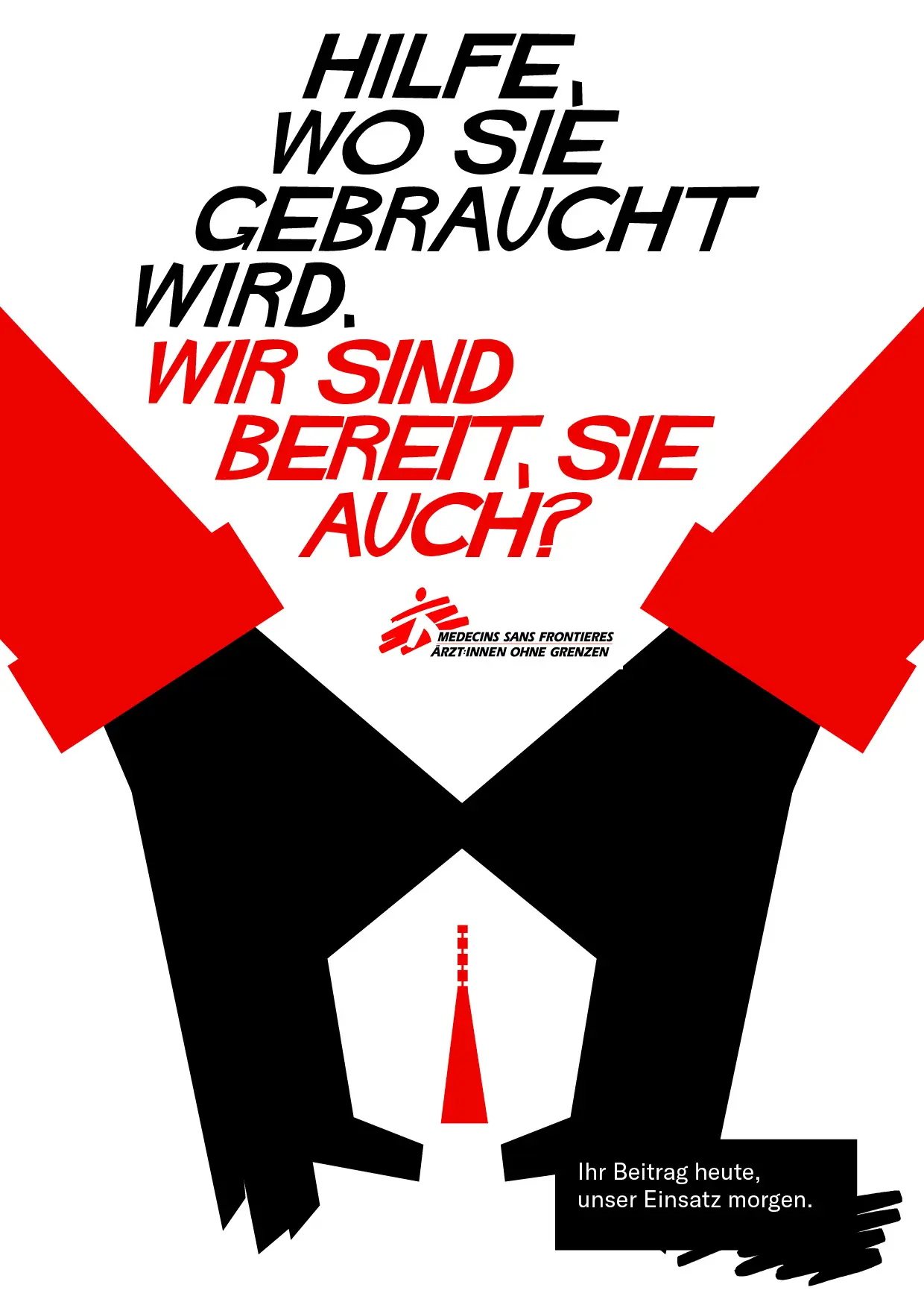
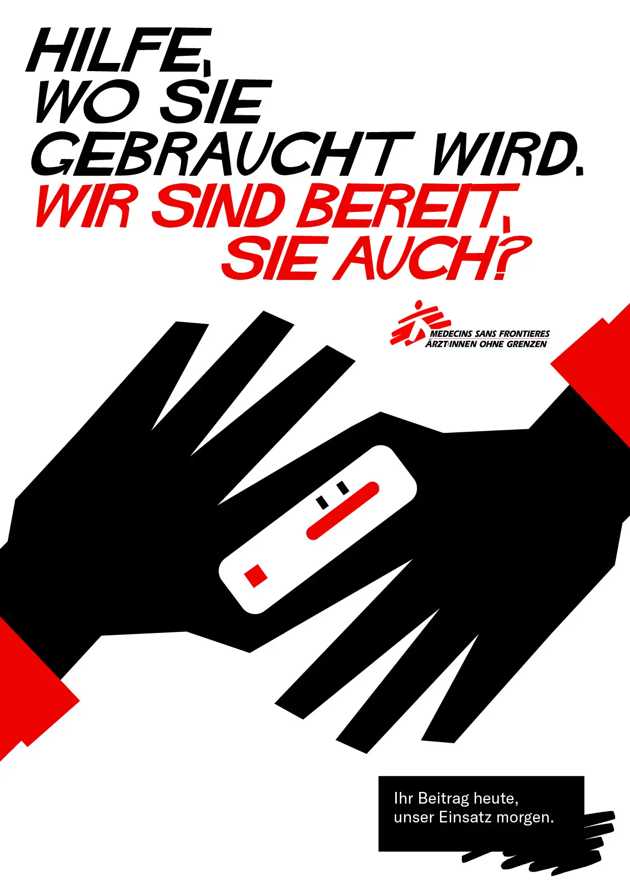
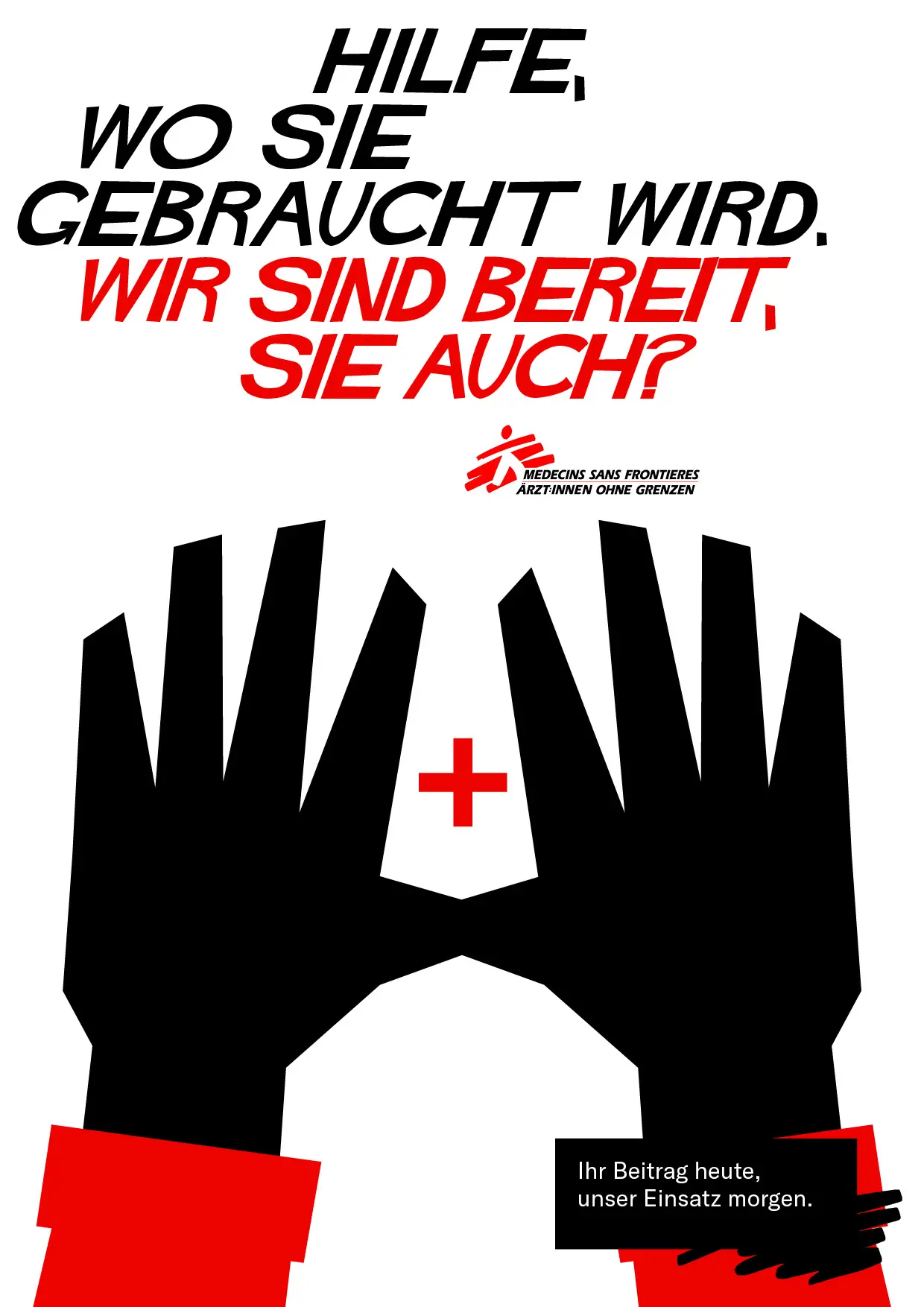
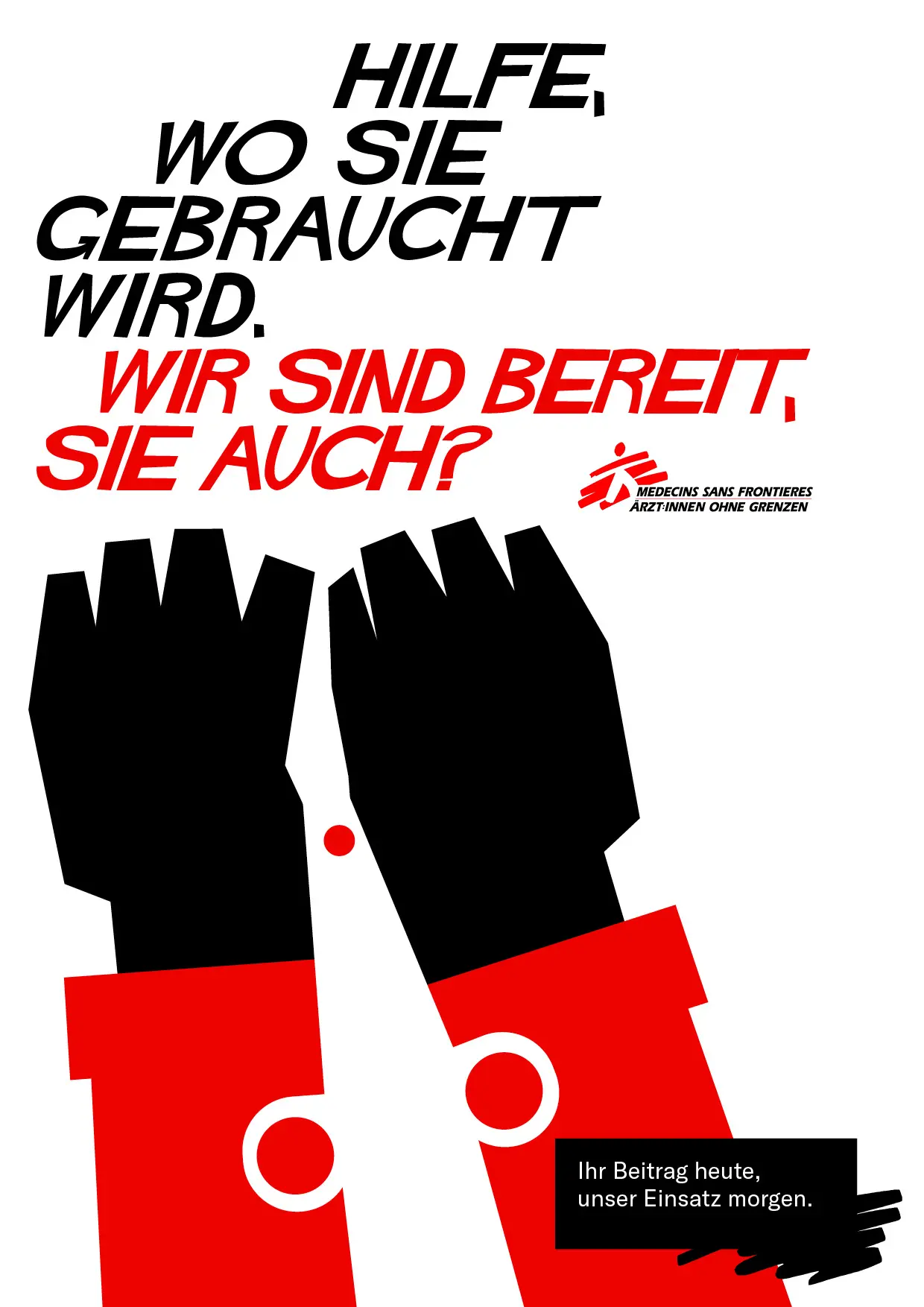
Creative direction of a fundraising campaign for Médecins Sans Frontières to show the work of the organization without using photos for it, as this is often not possible. The visual concept is inspired by the graphic work of Elaine + Saul Bass and MC Escher and uses negative space to communicate how MSF work—quickly, with creative solutions and without judgment. The campaign's communicative strategy makes donors a part of the organization and leaves them free to contribute in the future through a rapid response network. In this way, donors don't have to commit immediately, but they can participate directly in urgent and emergency situations.
creative services
Creative Direction
Campaign Design
Illustration
Affiliation + partners
You might also like

Scoville (Free Font)Typedesign

Let's talk about value-based communicationVisual Identity

Check mate, ragazzi!Visual Identity

We are young/loud/democraticVisual Identity
#ÖffiLiebeVisual Identity


